Brand & Media Kit
Everything you need to feature Top Townie — the logo, colors, type, and voice — in ready-to-use files.
The app your community deserves.
The logo
Our mark is a stacked "TT" monogram. Use the app icon on its own, or the wordmark lockup in running text. Keep clear space around it equal to the height of one "T," and never place the mark below 24px tall.
- Don't recolor the mark outside the palette below.
- Don't rotate or skew the mark itself.
- Don't add shadows or effects to the mark.
- Don't stretch, condense, or crop it.
The app icon uses an icon-tuned navy (#122747) and mint (#8AF2BB); the brand palette below is the canonical color system for everything else.
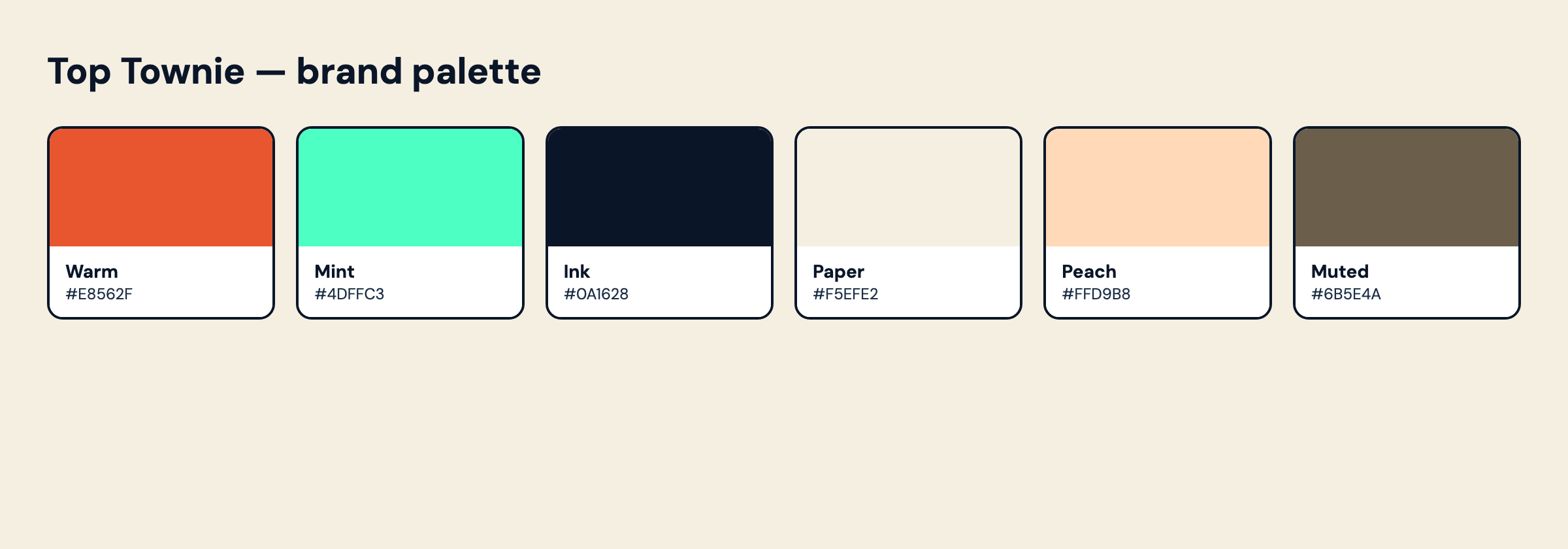
Color
The brand palette. Click any swatch to copy its hex. Warm leads, mint is the highlight, ink anchors, paper and peach are the surfaces.
Type
Three faces, all on Google Fonts. DM Serif Display for display, DM Sans for body and UI, Caveat for hand-written accents.
Voice & tone
Warm, local, plainspoken. We talk like a neighbor, not a platform.
- Local first — it's always about your community.
- Plainspoken, never salesy.
- Warm and neighborly.
- Anti-noise — no ads, no drama, no national feed.
- Confident, not loud.
| We say | We don't say |
|---|---|
| local spots | SMBs |
| your community | users / audience |
| what's happening nearby | content |
| no ads, no noise | engagement-maximizing |
The look
A paper-and-postcard system: flat color, hard offset shadows with no blur, 2px ink borders, a subtle paper texture, hand-drawn stamps, and a mint highlighter.
Hard offset shadow
6px 6px 0 var(--ink) — no blur. Cards sit slightly rotated, like a stuck-on sticker.
2px ink borders
Every card, input, and button is outlined in ink, on a paper-noise background.
Highlighter accent
Key words get a mint underline — skewed, hand-drawn, never a flat box.
Get in touch
Press & partnerships: inquiry@toptownie.com. Find us at @toptownie on Instagram and Facebook.
Made in the Mohawk Valley.